The Gallery Hair Experience
Website REDesignCLient
- The Gallery Hair Experience
Services
- Web design
- UI / UX
- Website Build
- Business Consult
Deliverables
- 5 Pages
- Icons
- WordPress
Other
- Booking System
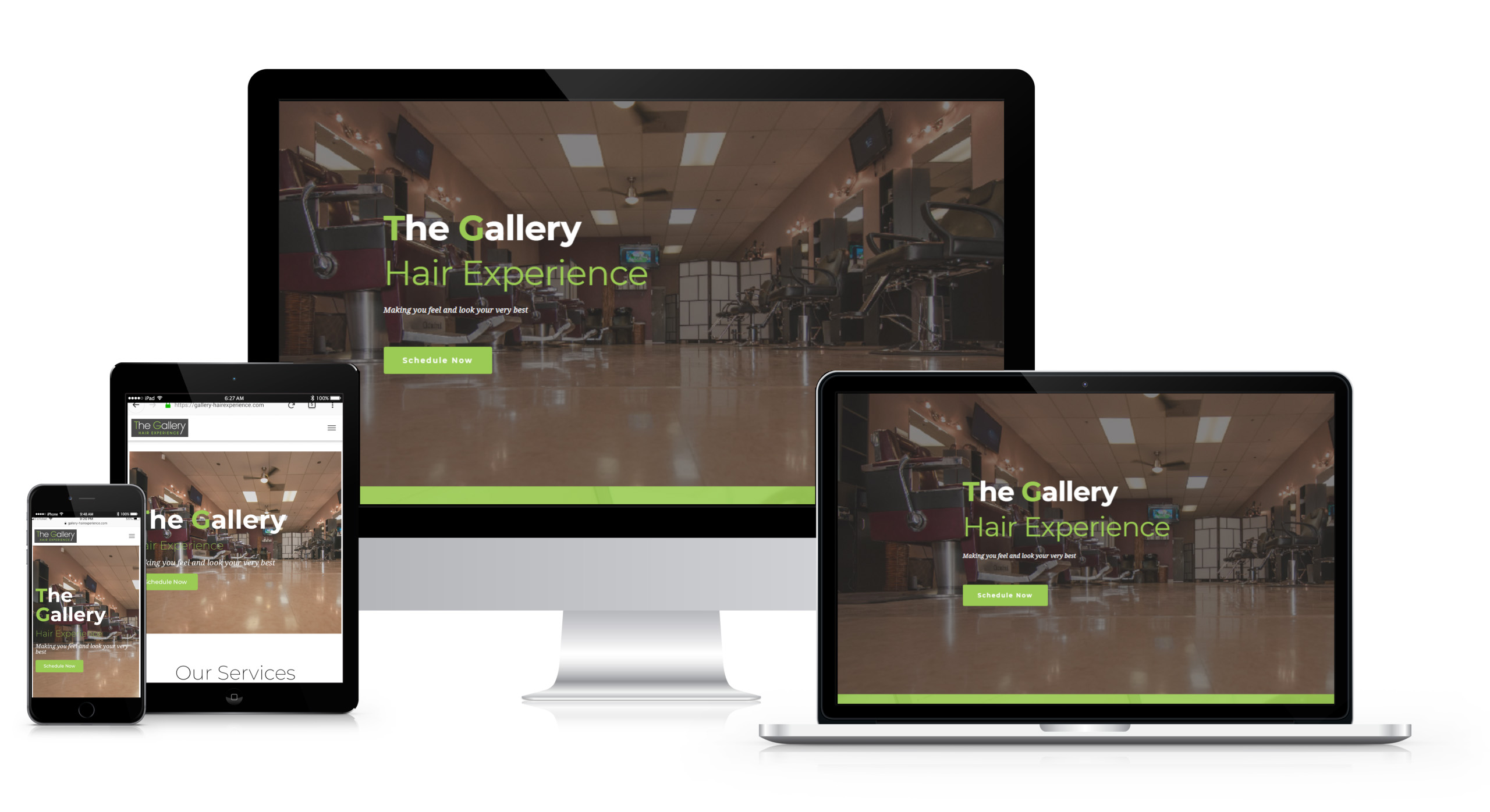
Project Info
Challenge
When designing The Gallery Hair Experience’s website, we faced many challenges. The client had limited information to provide us with, which meant that it was up to us to come up with ideas that would convey their business culture and art style accurately. They had an existing logo but did not have a clear vision in terms of what they wanted the new website design to look like.
Solution
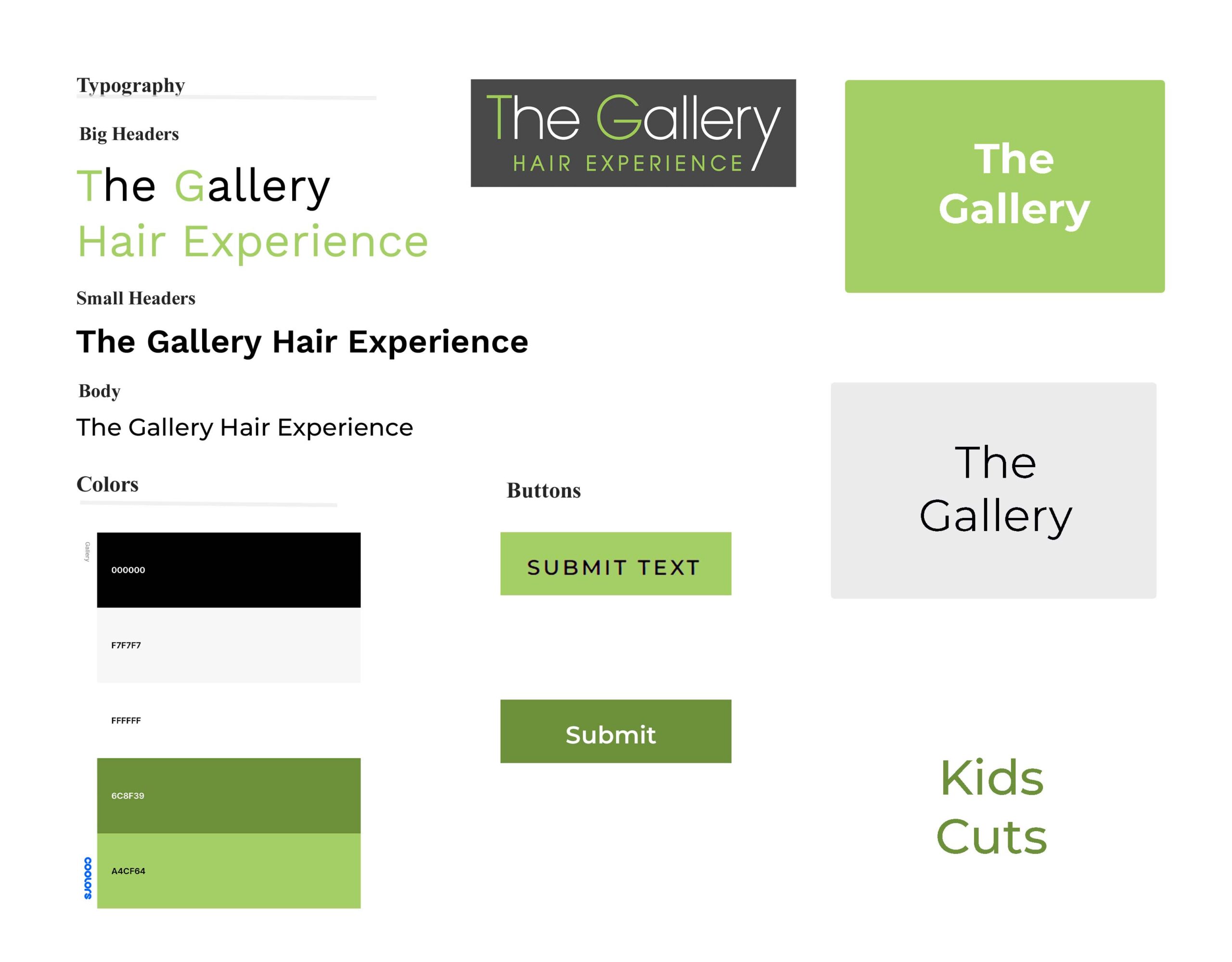
For The Gallery Hair Experience’s website redesign, we implemented a sleek combination of white, grey, black, and green to adhere to the logo colors. We kept the design simple with plenty of white space to maximize usability. The navigation was kept straightforward while the booking system was complex but ultimately incorporated seamlessly into the website design. Professional photos used on the site were in black and white as requested by the client, helping emphasize their brand identity even further.
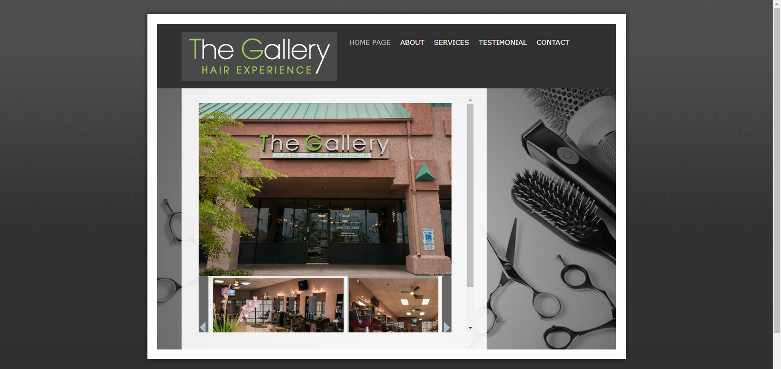
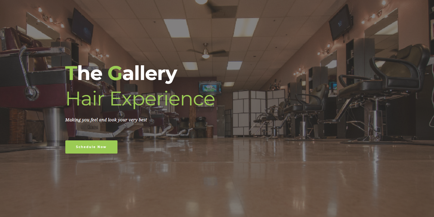
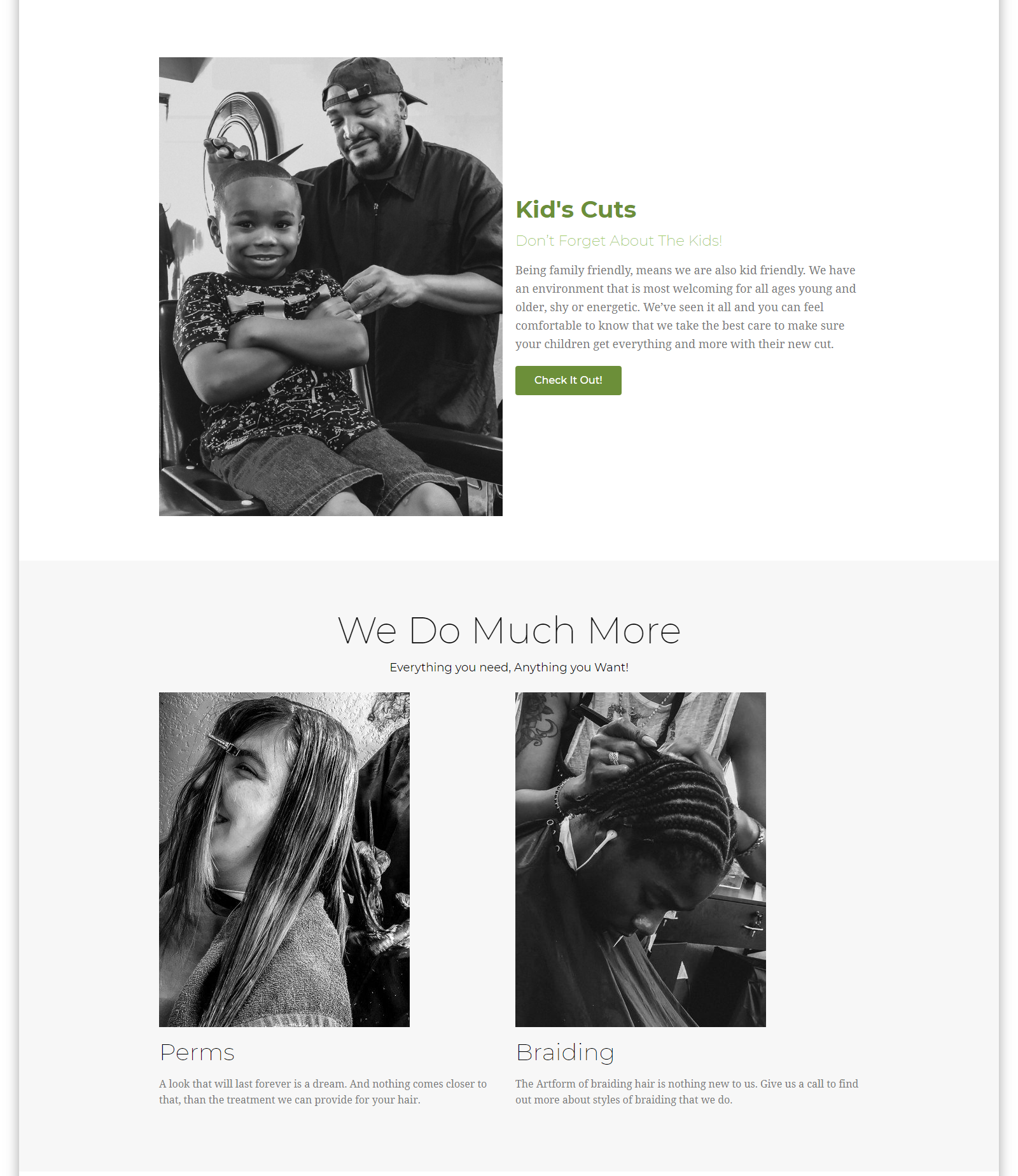
Website Design
Style Guide
Here is the style guided from The Gallery Hair Experience Project.
Update
Working on this project was fun and challenging a bit. The project was completed. The owner loved the website.

